Charts & Dashboards
Make business data visible – right in the intranet
Visualize KPIs, metrics, and business data with interactive charts directly in the Staffbase intranet
Overview
The Charts & Dashboards Widget brings business data directly into your Staffbase intranet. Visualize KPIs, metrics, and trends with professional charts — without employees needing to switch between different tools.
Why This Widget?
Data tells stories, but only when it’s visible. The Charts Widget makes relevant metrics accessible to everyone:
- ✅ Centralized: All important KPIs in one place
- ✅ Current: Auto-refresh keeps dashboards always up to date
- ✅ Accessible: Every department sees their relevant data
- ✅ Professional: Clean visualizations for management reports
Key Features
1. Versatile Chart Types
Choose from various chart types for every requirement:
- Bar charts (vertical & horizontal)
- Line charts with trend lines
- Pie charts and donut charts
- Area charts
- Gauges and progress indicators
2. Flexible Data Sources
Integrate data from various sources:
- REST APIs (JSON/XML)
- SAP modules
- Databases (SQL)
- CSV import
- Manual entry
3. Auto-Refresh & Live Data
- Configurable refresh intervals
- Real-time data updates
- Historical comparison values
- Trend display and delta calculations
4. Role-Based Dashboards
- Different views based on user role
- Management dashboard vs. team dashboard
- Location-based filtering
- Export for presentations
Typical Use Cases
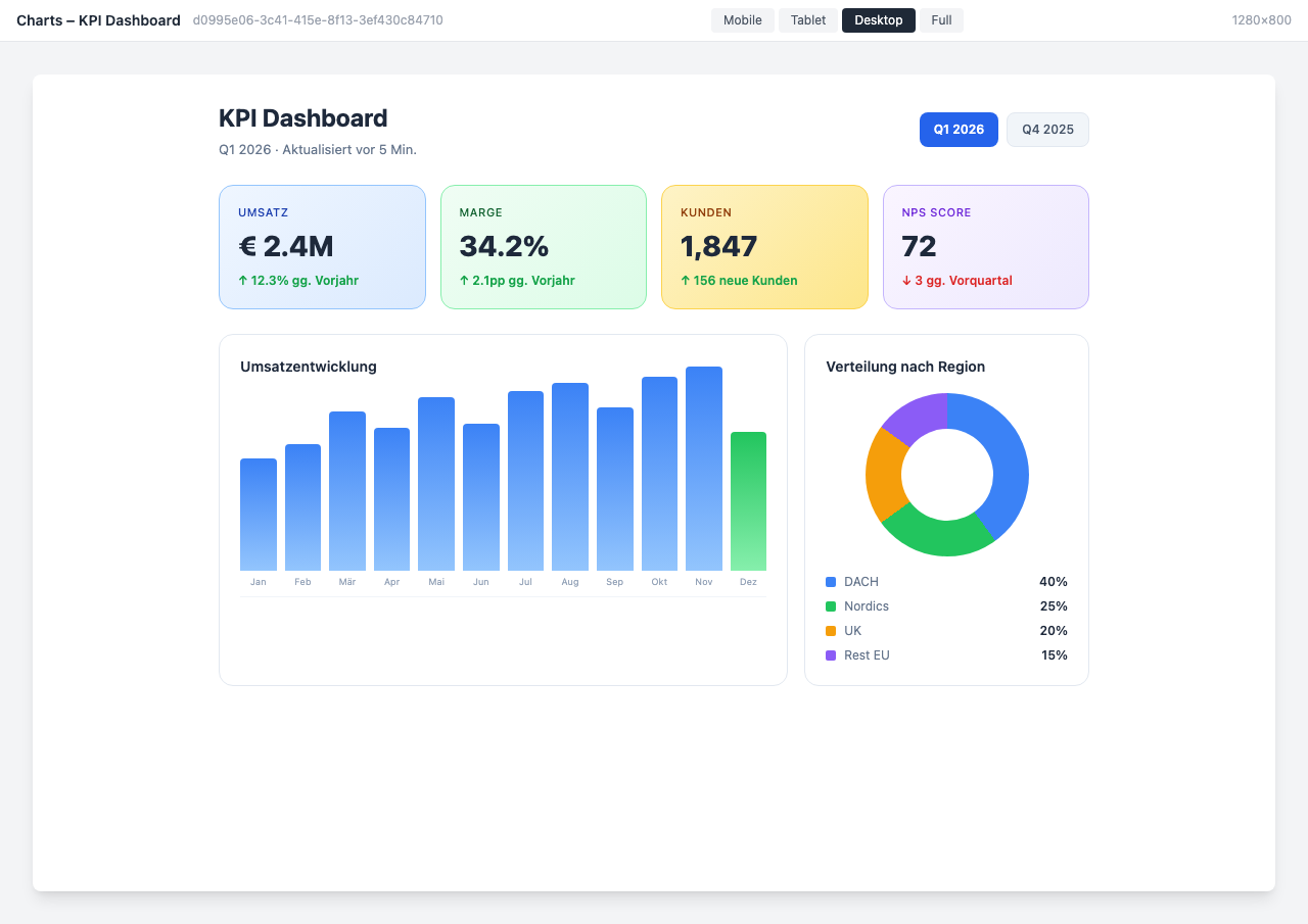
📊 KPI Overview for Management
Revenue, employee satisfaction, NPS, and other key metrics at a glance.
👥 HR Analytics
Visualize HR statistics like turnover, diversity metrics, and age structure.
💼 Sales Performance
Sales metrics, pipeline overview, and target achievement for the sales team.
🏗️ Project Tracking
Clearly display progress, budgets, and milestones of ongoing projects.
Integration & Setup
The widget can be set up in under 5 minutes:
- Select widget from the gallery
- Configure data source (API URL, credentials)
- Choose chart type and layout
- Publish
Done! The dashboard updates automatically.
Design Options
- KPI Dashboard: Metric tiles with trend arrows — ideal for the homepage
- HR Analytics: Specialized for HR statistics with diversity metrics
- Sales Performance: Revenue tracking with target comparison and pipeline
- Project Tracker: Project progress with Gantt-like display
- Energy Monitor: Sustainability and consumption data overview
Frequently Asked Questions
Which data sources are supported?
Any source with a REST API (JSON/XML). Additionally SAP modules, SQL databases, and CSV import.
How often is the data updated?
The refresh interval is freely configurable — from every minute to daily.
Can different teams see different dashboards?
Yes, through role-based access control you only see the dashboards relevant to your role.
Can I export dashboards?
Yes, export as PDF or image for presentations and reports is available.
Best Practices
- Clear structure: Maximum 6-8 metrics per dashboard
- Consistent colors: Uniform color scheme across all charts
- Provide context: Always show comparison values or trends
- Test on mobile: Check dashboards on smartphones too
Screenshots
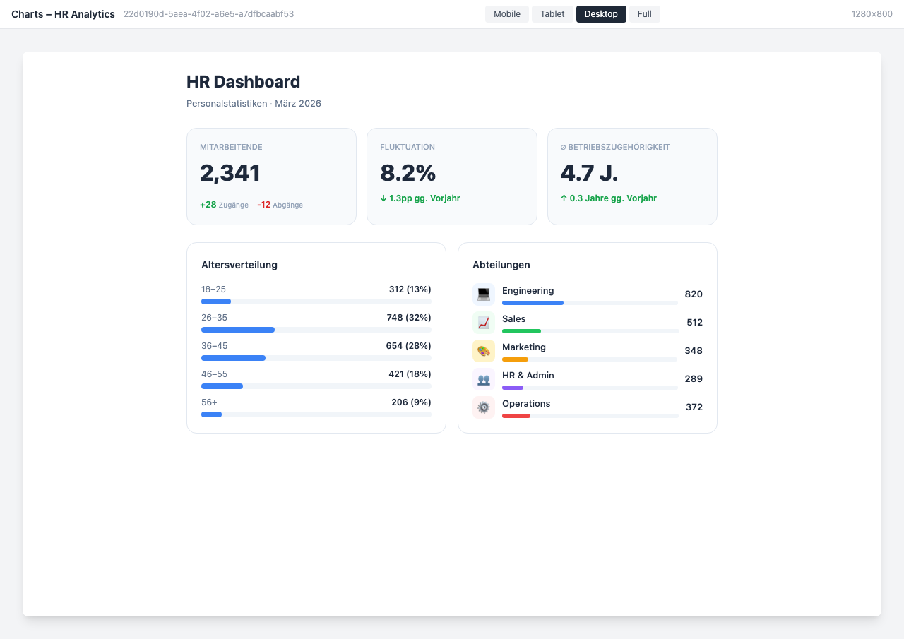
HR Analytics Dashboard
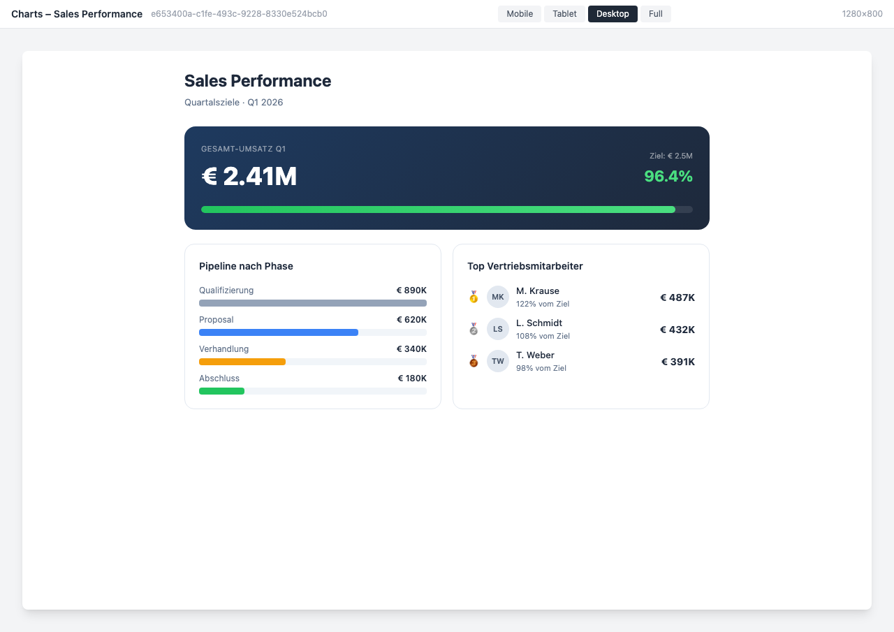
Sales Performance Dashboard
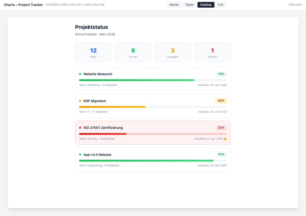
Project Tracker Dashboard
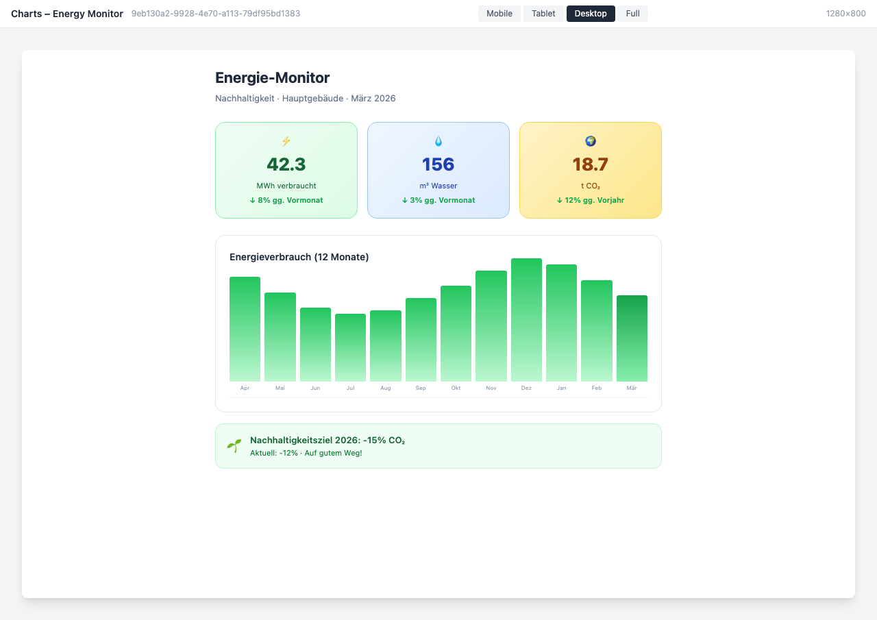
Energy Monitor Dashboard
Use Cases
KPI Overview
Revenue, employee satisfaction, and other key metrics at a glance
HR Analytics
Visualize HR statistics like turnover, diversity, and age structure
Project Tracking
Display progress and budgets of ongoing projects in a dashboard
Key Features
- Various Chart TypesBar, line, pie, and area charts for every requirement
- API IntegrationAutomatically integrate data from internal and external sources
- Auto-RefreshDashboards update automatically at configurable intervals
- Role-Based AccessDifferent dashboards for different audiences
Integrations
Questions about the Charts & Dashboards?
Our team is happy to help you personally