Your frontline intranet doesn’t have an adoption problem. It was never built for frontline. You bought an office newsletter with a mobile skin, and now you’re surprised the shift isn’t opening it.
That’s the uncomfortable truth behind most frontline adoption intranet reports sitting in your inbox. Logins spike right after rollout, then fall off, and the shift WhatsApp group keeps debating the schedule. Not because the workforce is “digitally underserved.” Because the tool doesn’t do the job frontline would actually need it for. Workers don’t scroll through CEO updates, they look for their shift schedule. And until they find it on the home screen in under two seconds, the platform is broken from their perspective, no matter how polished the hero images are.
This is also where this article ties directly into the Operations shift in the Staffbase intranet : frontline adoption isn’t only a Comms topic. It stands or falls on whether the intranet carries operational use cases (shift handover, asset status, safety acknowledgment) or only news.
This article breaks down four common anti-patterns, walks through four concrete fixes, and gives you a measurement logic that separates real adoption from vanity metrics. Written for frontline experience leads, digital workplace operations owners, and internal comms teams who already know that “post more news” is not the answer.
Who’s actually frontline?
Before we talk adoption, let’s get precise. “Frontline” is not a synonym for “everyone who’s not in the office.” Four personas, four different realities:
Shift workers (manufacturing). Plant operator, machine technician, logistics lead on the floor. Looks for: shift schedule, handover, plant status, safety acknowledgment, vacation request. Uses the intranet two to three times per shift in 30-second windows. No second hand free, often gloves on the touchscreen, screen on the floor not always clean.
Field service technicians. On the road between customers, workshop, warehouse. Looks for: next ticket, route info, parts availability, service report upload, expense claim. Uses the intranet in the car before the appointment and at the hotel in the evening. Mobile-only, often in a dead zone, battery low.
Retail floor. Sales associate, store manager, register staff. Looks for: weekly campaign plan, staff roster, register handover, stock levels, fast feedback to HQ. Uses the intranet on a shared store tablet or their own phone on break. Low tolerance for login pain, high expectation that “it just works.”
Care staff (healthcare). Nurse, ward lead, housekeeping. Looks for: duty roster, handover, hygiene acknowledgment, training status, escalation contacts. Uses the intranet between two patients, often in 15-second windows, frequently on a ward tablet someone else is using.
What ties all four together: no dedicated desk, no leisurely five-minute sessions, no interest in content that doesn’t directly relate to the next shift. That’s exactly why the standard news-feed layout is the wrong design choice.
Anti-pattern 1: “Everything is news”
You open the intranet on a frontline device and see: three hero sliders with the CEO’s photo, an “Employee of the Month” tile, a stream of ten unread posts from marketing and HR. The shift schedule? Three scrolls down, maybe.
Why it happens. The intranet was built by internal comms, with comms logic. Comms thinks in posts, reach, and “the story has to land.” Frontline thinks in action items: what do I need to do next, what changed, where do I sign off.
What it costs. When a shift worker can’t find the schedule on the intranet in under ten seconds, they switch to the WhatsApp group or call the shift lead. Both make the intranet redundant from their point of view. With 800 frontline employees and three shifts a day, you quickly accumulate hundreds of avoidable phone calls per week. And the comms posts the layout was optimized for? Nobody sees them anyway.
The fix. News goes to the bottom or into a dedicated tab. The top is reserved for the three to five action items relevant to that shift: schedule, open acknowledgments, current plant status, one “what’s new today?” block. Everything else gets scrolled past, no matter how important it is to comms.
Anti-pattern 2: “No login on personal devices”
You require frontline staff to install the official employee app on their personal phone, set up 2FA via Microsoft Authenticator, and log in over VPN every morning. But: no data plan from the employer, no work phone, no compensation for off-shift app usage.
Why it happens. IT thinks in compliance, not in adoption. “Everyone needs the official app” becomes policy without anyone asking whether the usage terms are realistic for the actual workforce.
What it costs. Half your frontline never downloads the app. The other half uninstalls it after three weeks because daily login is a chore. You’re sitting on a €200K license that doesn’t work for 40% of its actual target audience.
The fix. There has to be a path that works without app installation, for example a QR-code login on a ward tablet or a floor display that opens a time-limited session. Plus: a mobile-web path without 2FA friction for non-critical content (shift schedule, lunch menu, notices). For compliance-relevant actions (safety acknowledgment, payroll), trigger the full auth flow there, not when someone’s checking their schedule.
Anti-pattern 3: “Employee directory ≠ employee tool”
You have a great employee directory: photo, department, phone, Outlook availability. The store manager doesn’t find what they’re looking for in there. They’re not looking for a person, they’re looking for today’s campaign plan, stock levels, or the regional hotline.
Why it happens. “Employee experience” gets misread as “profile searchability” in many projects. A directory is nice, but it’s not a tool. Tools have action buttons, directories have follow-up information.
What it costs. The platform feels to frontline like a pretty internal LinkedIn the company runs, but not a tool. Result: the intranet competes with LinkedIn for attention and loses.
The fix. Keep the directory, but it’s not the frontline hero element. Frontline tools are shift widgets, acknowledgment widgets, status widgets: modules that are one click away from a completed action. The directory sits as infrastructure behind that, not as the stage.
Anti-pattern 4: “Comms tone doesn’t fit”
The site newsletter opens with “Dear colleagues, in these dynamic times it is our heartfelt concern…”. The shift lead skims it, sees no information, closes the app.
Why it happens. Internal comms writes for its actual core audience: the office workforce that’s used to and partly expects this register. Frontline is a different audience with different reading expectations.
What it costs. Even when a post is genuinely relevant (e.g. a change to safety rules), frontline doesn’t read it through. The information doesn’t land, even though it was technically delivered. And you wonder why the acknowledgment rate stays under 60% despite “the comms going out.”
The fix. Tone per persona. For frontline: short sentences, action item first, no preamble. For store managers: weekly focus, numbers, campaign plan. For office: comms-letter register is fine. That doesn’t work with a single newsroom and a single post. You need templates, targeting, and different content blocks per audience.
Four anti-patterns, four levers: frontline adoption in the intranet isn’t fate
These four anti-patterns aren’t laws of physics. They’re layout, auth, and tone decisions that any Staffbase setup can rework, without a new license and without a platform switch. What it takes is targeting at the persona level and a few Operations widgets that enable real action instead of news consumption. The four levers below.
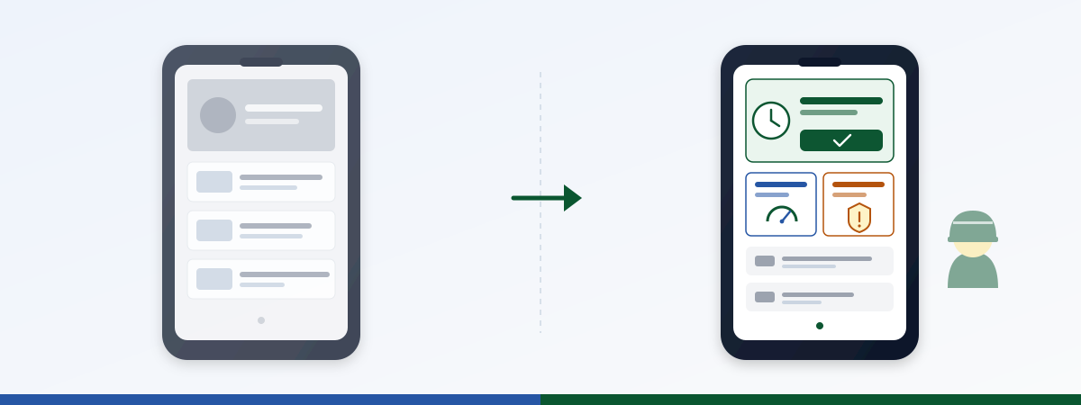
Fix 1: Action-first home screen
Reorder the home screen: the top three slots go to action items relevant for the current shift and role. News drops to the bottom or into a dedicated tab. Targeting carries the weight: the shift worker at the northern plant sees something different up top than the store manager in Munich.
Concretely: a shift schedule widget as the first element, followed by a status module (open acknowledgments, due trainings) and a personal “what’s new on your shift?” block. Company news comes after that.
In the pilot projects we’ve supported, this re-layout alone dropped time-to-action (seconds between opening the app and completing an action like checking the shift or signing an acknowledgment) from around 45 to under 12 seconds, with the same license and no new content. It’s purely a layout question.
Fix 2: Offline-capable + QR-code login
Frontline doesn’t work in a perfect-Wi-Fi office. Plant floor, store, on the road, dead zones. The intranet has to handle that: cache content, sync later, and use login flows that take five seconds to clear.
Concretely: for non-critical content (shift schedule, lunch menu, notices), a QR code on a ward tablet or floor display opens a time-limited session. The QR links widget brings this pattern into the intranet as a reusable element: one QR code per site, per shift, per notice.
For compliance-relevant actions, the full auth flow stays. But it’s not the default for every click. Most frontline sessions are read sessions, and reading doesn’t need 2FA.
Fix 3: Operations use cases as widgets
The intranet stops being a comms magazine and becomes an operations surface. Shift handover, plant status, safety acknowledgment, IT service status: these are the modules frontline actually needs daily.
Concrete widgets you can deploy today:
- Shift handover : structured handover per shift, with acknowledgment logic and escalation path
- IT service status : stores and shop floors see at a glance whether central IT is up
- Pulse check : short mood check per shift instead of an annual employee survey
- Hybrid booking : desk, training room, pool vehicle
We covered five additional operations use cases in a dedicated article . The point here is: each of these widgets is its own adoption lever. Not “the app,” but “a tool that solves my shift problem.”
Fix 4: Tone per persona
Store manager, shift worker, care staff and office worker read differently. That’s not a stylistic preference, it’s a function of their working reality. If you push comms-letter register to all of them, you reach one persona and lose the other three.
Practical approach: persona-specific templates, targeting on site/role, and a clear “action-first” pattern for frontline posts. The site comms person at a store writes differently than corporate internal comms, and both are right. The intranet has to allow both in parallel.
This needs widget templates that bake the tone in (short headline, action button, one sentence of context), not a single post template optimized for long form.
What counts, what doesn’t
The most common mistake in frontline adoption reports: logins are celebrated without anyone asking what those logged-in users actually did.
Vanity metrics (drop them or contextualize):
- Login counts. Says nothing about whether the intranet did a job. Someone who logs in, scrolls, gets frustrated, and leaves counts the same as someone who successfully checked their shift.
- Aggregate DAU. The global daily-active-users number averages across office and frontline and hides exactly the adoption problem you’re trying to measure.
- Post reach. Says nothing about action. A post with 80% reach that nobody acts on is not a success.
Real metrics (steer on these):
- Task completion rate. How many delivered acknowledgments are actually signed? How many shift checks led to a completed shift?
- Time-to-action. Seconds between opening the app and completing an action. When this number drops, adoption is moving.
- DAU per site and per shift segment. Only this breakdown shows whether early shift at the northern plant is using the platform and late shift at the southern plant isn’t, and therefore where to intervene.
Before/after from a pilot project:
| Metric | Before (news-feed layout) | After (action-first + QR login + operations widgets) |
|---|---|---|
| Frontline login rate | 61 % | 78 % |
| Time-to-action | 45 sec | 11 sec |
| Shift acknowledgment rate | 58 % | 91 % |
| DAU late shift, plant B | 12 % of headcount | 47 % of headcount |
The login rate went up. That’s the vanity number. The actual win is in the other three lines.
Frequently asked questions
Do we have to rebuild everything?
No. Frontline layout is a targeting and widget question, not a platform swap. You build on the existing Staffbase install and replace the frontline home screen with a dedicated layout for that audience.
What about internal comms, do they get sidelined?
The opposite. When the shift schedule sits at the top, frontline opens the app at all. Comms posts then have a real chance at reach. Before, they were prominent, but nobody saw them because nobody opened the app.
How do we measure time-to-action cleanly?
Via custom events: timestamp on app open, timestamp on first successful action click (shift check, acknowledgment, status check). Delta per session, median across the workforce. Staffbase delivers the eventing layer; the analysis runs in your standard analytics stack.
Do we strictly need QR-code login?
Not strictly, but strongly recommended if you have real frontline personas (no fixed devices, shared tablets, no work phone). Without QR-code login, you absorb adoption losses that pure app-auth flows can’t repair.
What about compliance, do we lose audit capability?
No. Compliance-relevant actions (safety acknowledgment, payroll, personalized data) stay behind the full auth flow. What you ease are read actions and trivial acknowledgments. Exactly that biggest-friction reduction drives overall adoption.
We have targeting rules but they don’t fire. Why?
Most common cause: user attributes from HR aren’t current. The site is in HR, but recent transfers haven’t synced to the identity platform. Targeting rules on stale attributes produce wrong visibility. Check the sync first, then debug the rules.
How big does the team need to be for this rebuild?
Small. One owner per site from comms or operations, plus one central widget configuration owner. The pilot phase with one or two sites and four to five widgets typically runs in four to six weeks. Scale-up after that is template work, not a rebuild.
Next step
Frontline adoption is not a comms problem. It’s a product problem with concrete fixes: action-first layout, low-friction login, operations widgets instead of news feed, persona-specific tone, plus a measurement logic that separates real action from login theater. Teams that push this through move adoption numbers that have been stuck for months in under two quarters.
Sitting on a frontline adoption problem of your own? Ping us on LinkedIn (JASP) with a 2-sentence brief (“industry, number of frontline roles, what you measure today”). We’ll respond inside one working day and give you in a 30-minute walkthrough a concrete layout and use-case proposal, not generic advice, but something scoped to your personas and your use cases.
Go deeper
- Widget gallery : 40+ pre-built widgets, Operations-ready (e.g. shift schedule , pulse check , QR links for low-friction login)
- Pillar: Staffbase Operations 2026, From Triangle to Square : strategic frame
- 5 operations use cases beyond standard widgets : shift handover, machine status, safety acknowledgment, quality reporting, store KPI
- Shift handover in the intranet : the first Operations use case with ROI table